Western governors university


Title
Senior UX/UI Designer

Tools
Sketch, Figma, InVision DSM

Scope
UI Design
Design System Migration & Governance
Design System Documentation
Training & Education
Accessibility
Responsive Web & Native App

Overview

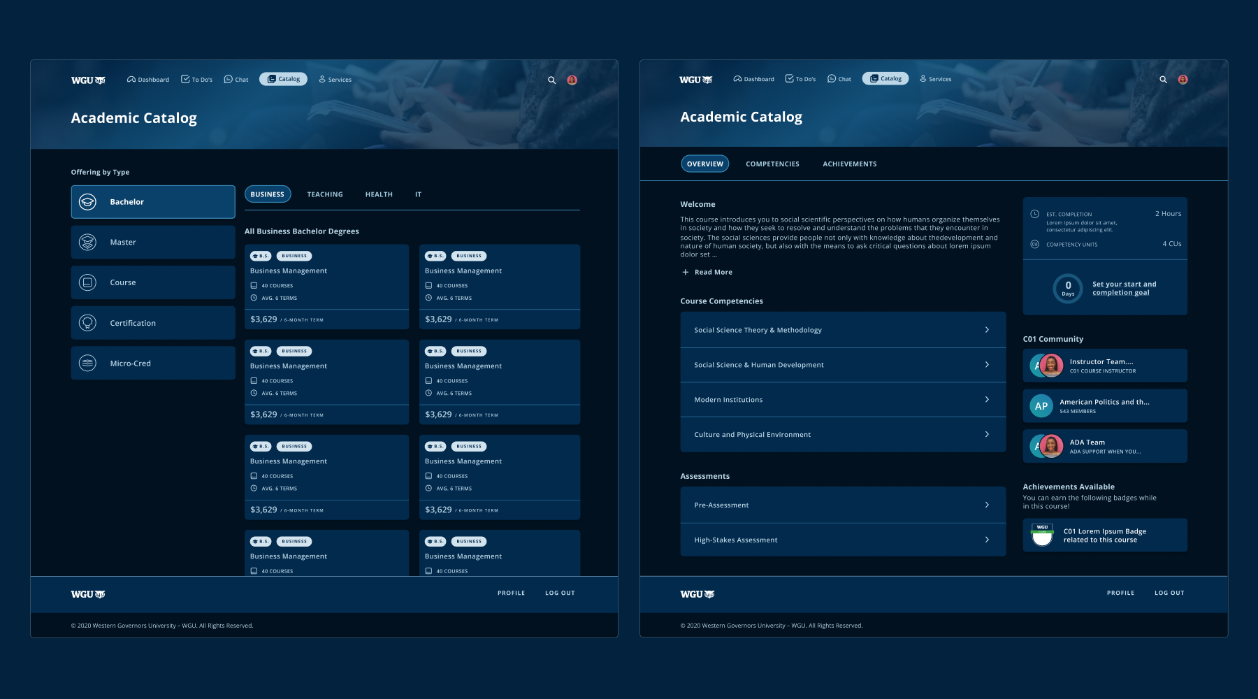
WGU’s student portal was being transformed, a process that involved reviewing our tech stack, addressing design debt, and migrating an in-progress design system from Sketch to Figma, while driving adoption of our design system resources through thorough documentation and scheduled education/information sessions.

During the Figma migration, we took the opportunity to conduct a full system audit, and removed, added, and edited styles and components while working closely with our front-end dev team to align on organizational principles and design tokens.

My Role

I began working with WGU as an agency contractor, then transitioned to their full-time EdTech UI design lead. In that position, I was involved in identifying our tech stack pain points, and was responsible for presenting to relevant stakeholders to advocate for the switch to Figma. I then spearheaded the design system migration, collaborating with and delegating tasks to three junior designers, while keeping open communication with our front-end dev team.

Aside from design system creation and governance, my other day-to-day responsibilities involved managing and distributing work across my junior team members, conducting peer reviews, and completing my own ready for handoff Hi-Fi screens, using assets from our design system.

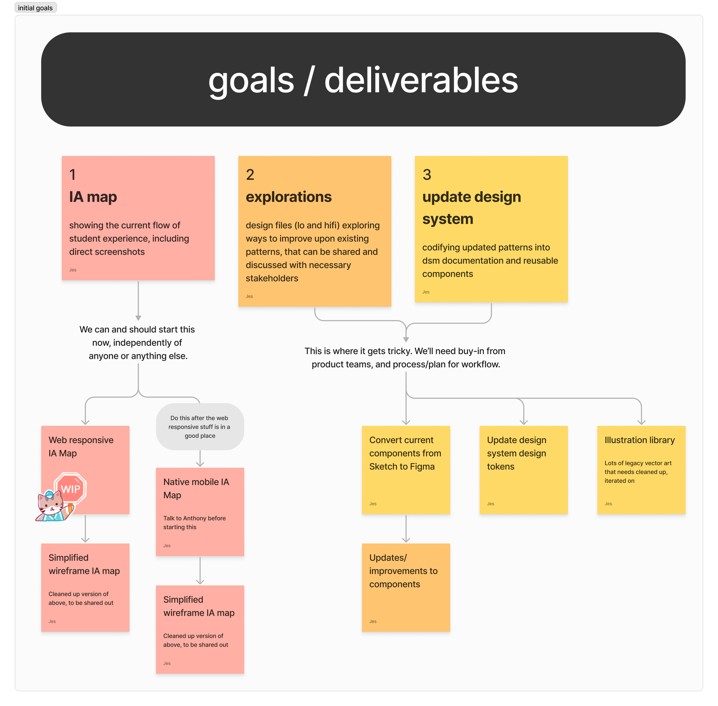
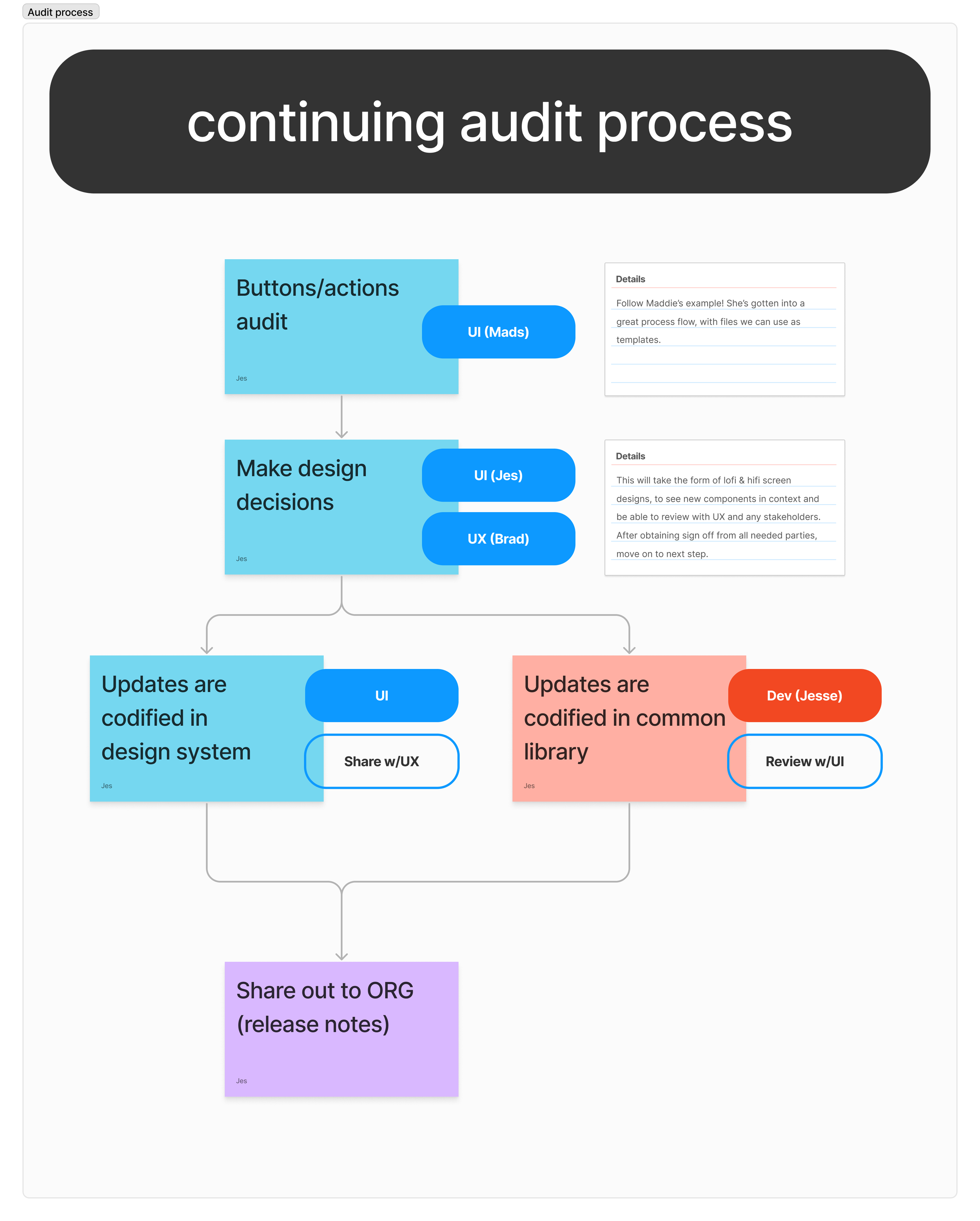
I presented to relevant business, developer, and design stakeholders and explained the pain points in our tech stack, as well as the advantages of slimming down and migrating to Figma.


I mapped out processes and priorities for the design team to tackle the migration and audit of all components.


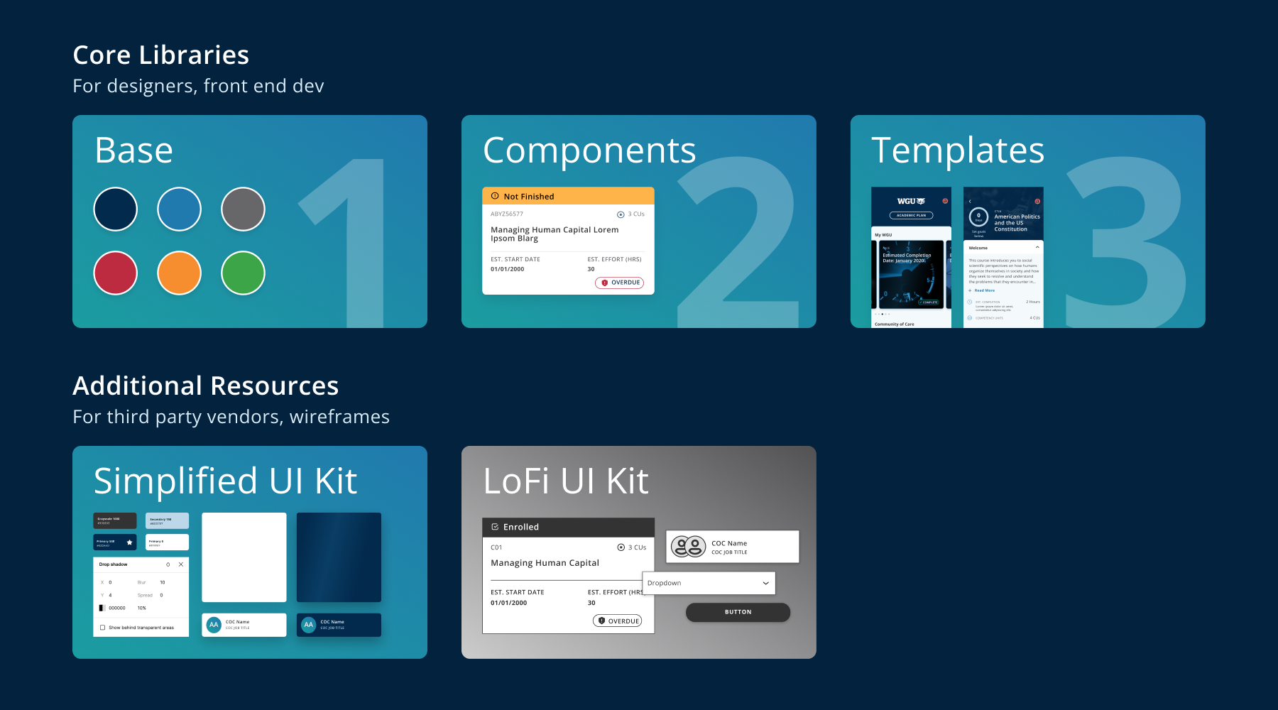
The UI team met with UX designers and front end developers and decided to organize our libraries around a simplified atomic structure, with Base flowing into Components, flowing into Templates.

This aligned nicely with how our developers thought about coding components, and allowed designers to navigate fewer overall files.


Style and component documentation was handled natively within Figma itself, both as text on frames and in component descriptions.


Overview documentation was included in each section of the design system (Base, Components, Templates). Our files were regularly accessed by both designers and developers, so this documentation was focused on keeping us aligned on how we expected our files to be navigated, and how we communicated about the status of working files. This was also a great opportunity to reinforce our responsibility to maintain ADA Compliance as an educational institution.


Full hi-fi screens live in the Templates section of the library, showing how our components work together, and serving as an easy jumping off point for new flows.


In addition to our core libraries, supplemental libraries were created to support the brand at large.

A simplified UI kit contained all the basics necessary to execute on-brand CSS styling when working with third party vendors.

A lo-fi UI kit was created to support our growing UX team, to unify visual language and decrease confusion when talking through work with different product teams. The lo-fi UI kit was not meant to be proscriptive, but simply a useful optional tool, especially helpful to onboarding new UX designers.